Veille
Bridging Citizens and Cities
Role
Product Designer
TOOLS
Figma
FigJam
TEAM
Me!
TIMELINE
May 10-11, 2025
(30 Hours)


Description
Reimagining a solution to urban infrastructure reporting in 30 hours.
Veille was developed during the 2025 DubsTech x Design Buddies Protothon, a 30-hour sprint to design solutions for real-world problems. I set out on the city track to bridge the communication gap between citizens and their cities by building an intuitive, privacy-conscious mobile app that empowers residents to report and track urban infrastructure issues.

Modern cities are listening - but citizens aren't being heard.
Civic issue reporting today is scattered - emails, social media posts, and fragmented platforms make it difficult for city officials to track and respond efficiently. The result? Redundant reports, slow resolutions, and frustrated residents left in the dark after filing complaints. While cities may be listening, there’s little clarity or feedback for the people who speak up.
A missing link in civic communication.
Cities increasingly recognize the need for transparency and collaboration but lack the tools to make it happen. My solution bridges this gap by giving citizens a visual, intuitive way to report issues while ensuring complete visibility into how those issues are resolved.
When citizens feel heard, engagement grows. And when governments gain clarity, resources can be used more effectively. It’s a win for both sides of the system.
Research
What existing civic tech gets wrong (and what I learned).
To dig deeper into the disconnect between citizens and municipalities, I examined civic reporting platforms like Seattle’s Find It, Fix It and several 311 services across the U.S. From these perspectives, three patterns of frustration consistently emerged:

Understanding user needs on a personal level.
With a clear understanding of the problem space. I developed a persona to ground my design decisions in real human needs and motivations. Maya was shaped by my research and recurring themes in civic feedback, and helped me stay focused on building for actual users.

Ideate
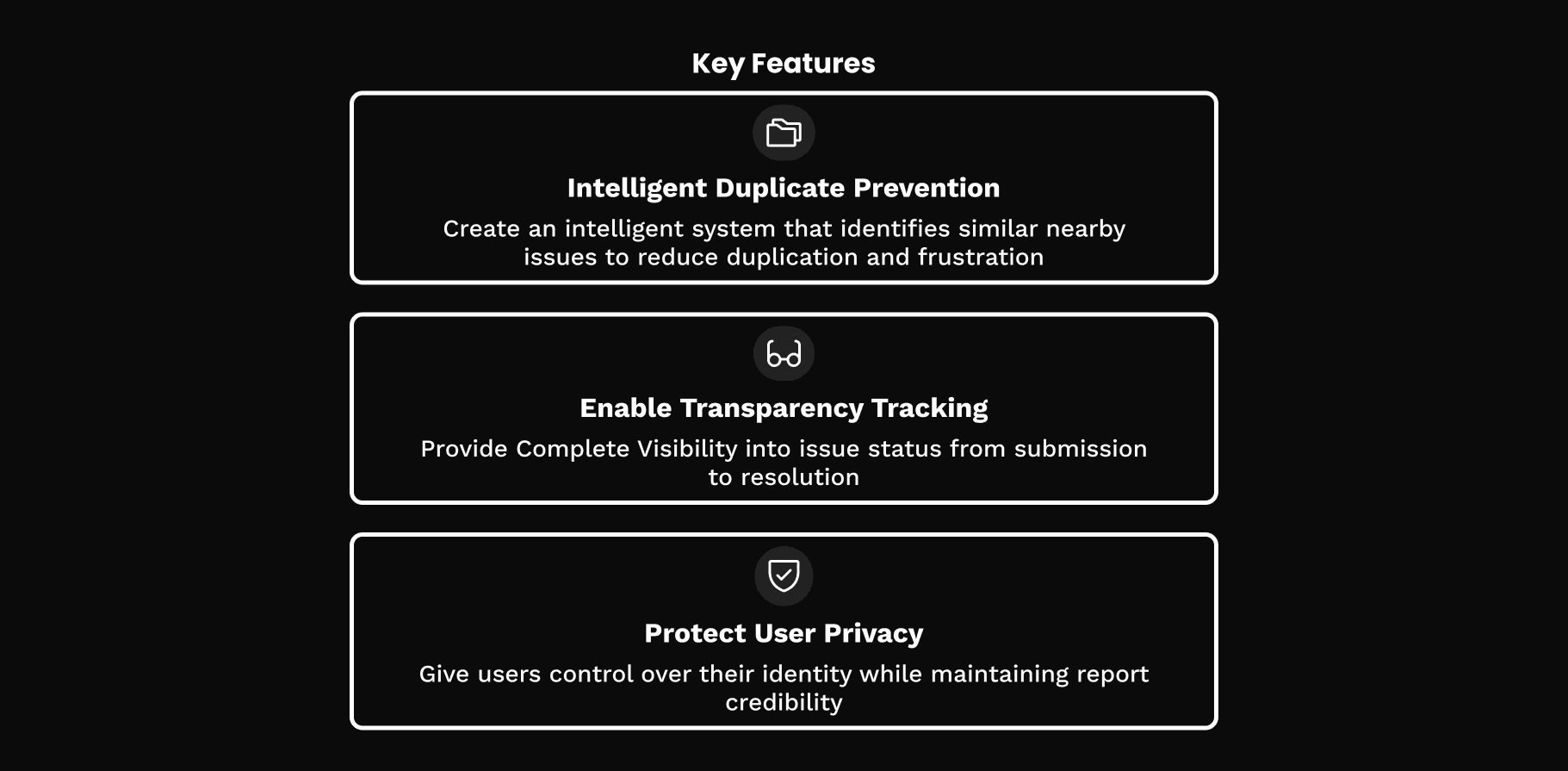
Translating insights and persona needs.
Grounded in research and Maya’s experience, I identified three core features that would shape Veille’s design. Each one speaks directly to the frustrations and expectations uncovered during the research phase:
Mapping a bird's eye view of the full user experience.
To make sure Veille didn’t just solve part of the problem, I mapped out the full engagement loop. This user journey helped me visualize how key features would interact to form a cohesive and satisfying experience.

Here’s how Veille transforms fragmented reporting into a cohesive civic engagement loop:
Discovery & Awareness: Users land on the map screen that lets them browse neighborhood issues or start a new report.
Intelligent Reporting: A duplicate detection system flags similar nearby reports, letting users “watch” existing cases rather than creating redundant reports.
Transparent Progress Tracking: A real-time timeline provides clear status updates and municipal responses, so users stay in the loop.
Verification & Closure: Once issues are fixed, users verify resolutions, creating accountability and confirmation.
Community Recognition: Resolved issues can be shared, celebrating progress and building civic pride.
What's typically a frustrating one-way submission process becomes a satisfying loop with clear visibility from start to finish.
Design
Rapid-fire mockups.
With a clear user journey and research-backed features, I jumped into low-fidelity wireframes in Figma to quickly bring Veille’s concept to life. These initial designs focused on completing the core loop, while also ensuring that the most critical user needs were addressed before visuals were applied.


After developing the initial wireframes and basic interface concepts, I sought feedback from one of the Protothon mentors to validate my approach and identify opportunities for improvement. This session highlighted both strengths and areas for refinement before moving into high-fidelity designs.
Improve hierarchy, enhance duplicate and privacy features.
The mentor’s feedback directly shaped my final iteration, focusing on key areas where clarity and usability could be improved:
Strengthen visual hierarchy for transparency features: The timeline and status indicators needed strong visual structure to make progress more readable and trustworthy.
Enhance the duplicate detection visualization: This feature worked, but lacked clarity. I needed to make it more intuitive and gave users a reason to "watch" rather than report right away.
Clarify privacy settings: Transparency also meant users needed to clearly understand what’s public, what’s private, and how their data is handled.
Bringing Veille to life.
With time moving fast, I moved directly from wireframes to high-fidelity designs, focusing on addressing feedback while building an intuitive user experience. I channeled all feedback into crafting a polished final prototype that would bring Veille to fruition.
Maya's journey, reimagined.
To show how Veille delivers on its promise, I mapped out Maya’s experience, from the moment she notices a problem to the moment she feels heard. Her journey reflects the full engagement loop, transformed from confusion and doubt to clarity and impact.


Testimonial
What the judges noticed and what I took away.
The judges provided encouraging feedback that validated many of my design decisions:
"The flow of the user journey looks smooth and well-structured. The design looks clean and well-organized! However, it could be further enhanced by improving the font size, spacing and margins within the UI. The submission effectively addresses all the issues outlined in the rubrics.
Honestly, I'm really impressed with how the team designed the privacy settings—even including before and after verification option.
The presentation looks good and flows smoothly! Great job addressing all the problems while simultaneously implementing a seamless and intuitive UI experience!"
I was especially proud that the judges highlighted the journey flow. It was the area where I invested the most thought, ensuring that every step balanced usability with transparency. Their feedback confirmed my approach was on the right track.
I fully agree that the UI could be more polished. Looking again, the overall typography and spacing feels tight. These refinements would enhance readability and visual comfort and are a clear next step in polishing the interface.
What I'd do with more time and more voices.
With additional time, I would have brought more voices into the process, especially those who live this issue daily. Direct conversations with residents and city workers would have deepened my understanding beyond what just market and secondary research could capture.
In future iterations, I’d prioritize:
Usability Testing: To identify potential friction points with real users
Accessibility upgrades: To ensure the app serves every user, not just the "average" user
Visual refinement: Adjust typography, spacing, and margins as noted by the judges for a more polished and inclusive interface.
Reflection
No podium, but a giant leap in progress.
Although Veille did not place on the podium, this Protothon absolutely grew and tested me as a designer. I learned immensely about design and enjoyed the process all the way through.
As a solo designer, I had to learn how to manage my time and choose which steps of the design process to prioritize. The 30-hour time constraint forced me to make decisions about where to focus my energy - ultimately prioritizing user research, problem definition, and high-fidelity design over extensive iterations or testing. This tradeoff taught me great design isn’t about following every step in the design process, it’s about knowing which steps matter most in the moment.
Good design simply speaks, but great design tells a whole story.
One of the biggest lessons I learned was that a great design can feel empty without a great story. While I felt confident in my solution, I knew my presentation didn’t match the strength of my design. It reminded me that communication is just as important as design, especially in a setting like a Protothon.
Moving forward, I’ll put as much care into how I tell the story as I do into building the solution itself.